the tarot journal
Project OverviewA web-based app for storing and managing tarot readings digitally. Allows users to save them to their profile, then search, view, edit, or remove them.
RoleUX/UI Designer
Process
Problem StatementHow might we create an intuitive way to store information from tarot readings to easily reference later?
Competitive AnalysisDuring competitive research, there were no apps available (web or mobile) that allowed a user to store their tarot readings digitally. Other tarot apps serve mainly as a replacement for traditional tarot decks and not as a journal for taking notes on the readings themselves. There are also sites that provide information about the meanings of the cards.
MVP DeterminationDatabase of tarot cards w/ keywords
Ability to choose how many cards in your reading
Ability to choose what the cards you pulled were
Ability to add notes
Ability to store readings to your profile w/ name and date
Ability to view previous readings
Information Architecture & Site MapWhile reading the card interpretations during a reading, a larger screen size is preferable because of the large amounts of text and imagery. Knowing this, the app was best designed for a web-based, dashboard-like interface. There is some intentional friction for users to sign up before using the application. The first iteration does not allow for “guests”; account creation is a requirement for access.
User FlowIn the first version of the user flow, the journal and profile were at the same level in the hierarchy, with new readings being input within the tarot journal and account management and previous readings living nested within the profile.
WireframesTo reflect this, the dashboard was designed with side navigation. Users were also limited to choosing either a 3-card or 5-card spread, and then they would select the cards they drew from a dropdown. The image of the card would then populate within the layout on the screen.
However, this approach with the side navigation was no where near sufficient in presenting previous readings to the user, who could potentially have hundreds of readings stored. It would be very difficult for the user to search through those previous readings. In addition, placing imagery of the cards within a static layout on the screen to mimic real life felt cluttered. It was difficult to create consistent sizing/placement of elements on the screen, it was inflexible, would not scale easily, and would require imagery for all of the tarot cards.
This was unrealistic and limiting; there are thousands of styles of tarot decks, with beautiful artwork and imagery, as well as oracle decks that deviate from the traditional Rider-Waite tarot decks in symbolism, imagery and interpretations.
The question became how to make the layout more flexible and easy to scale, while also increasing the overall usability and presentation. This led to user flow 2.0.
User Flow (Revisited)With user flow 2.0, the nomenclature was readdressed and previous readings became part of the main navigation. Because of the amount of potential content the user could generate and store in that section, it required more real estate with additional features for ease of use.
UI Style KitBefore starting the high-fidelity designs for the user interface, a visual brand was established and a UI style kit created. This included a primary and secondary color palette, typography, and other UI elements adopted from Material UI.
High-Fidelity UI DesignsThe side navigation was replaced with a traditional top nav to increase screen real estate. However, the top navigation wasn’t sufficient for some of the auxiliary elements. For those items of navigation, there are secondary navigation elements in the footer.
With the new approach, instead of the user choosing a specific card layout and card from a dropdown, the user has the ability to dynamically add cards to the reading, rearrange their order, as well as upload a picture of the reading. This allows them to maintain the context of the unique deck used, as well as giving them total control over the cards stored to the reading.
At the time of writing, this app is in development.
Artifacts & Deliverables
Sample screens are included in the gallery.
To see the full UI kit and designs, view the project in Zeplin by clicking on the button below.
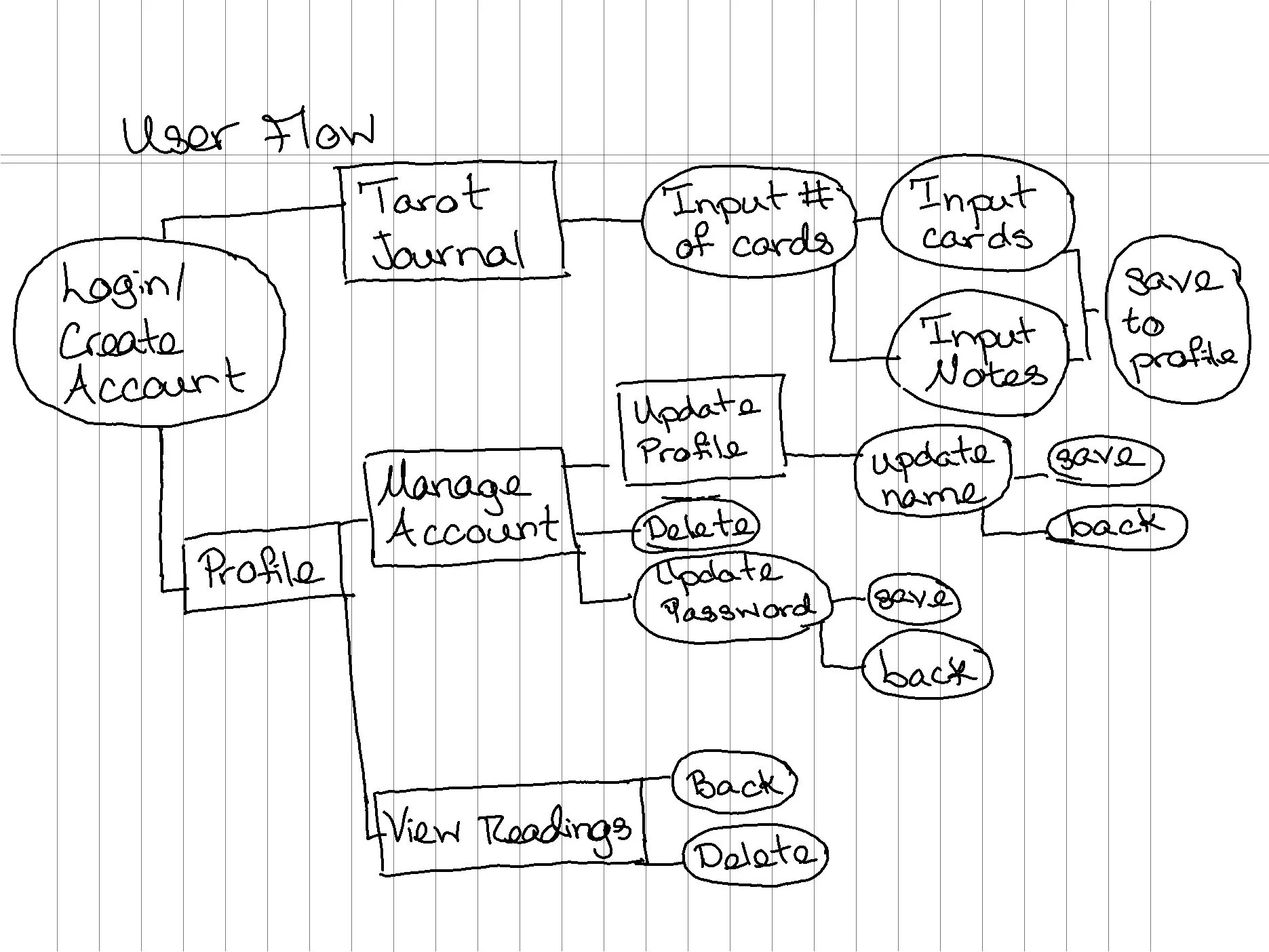
User Flow 1.0
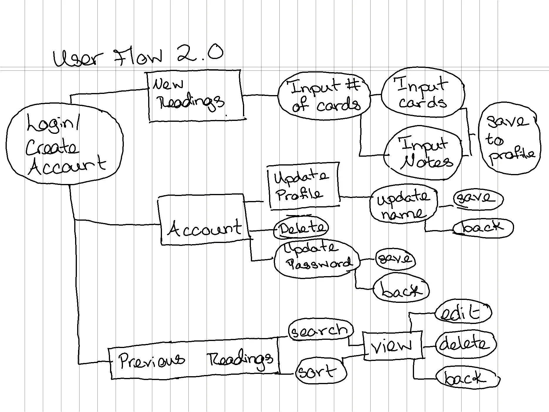
User Flow 2.0

UI Kit: Colors

UI Kit: Typography

UI Kit: Forms

UI Kit: Buttons

LowFi: Login Screen

LowFi: Choose Spread

LowFi: Three-Card Spread

LowFi: Account Screen

New Reading

Login Screen

Past Reading

Account Screen